The Execution Associates identity, narrowed to what we've chosen: one mark, one lockup, one typeface, and the look built on them.
Logomark
EXA monogram
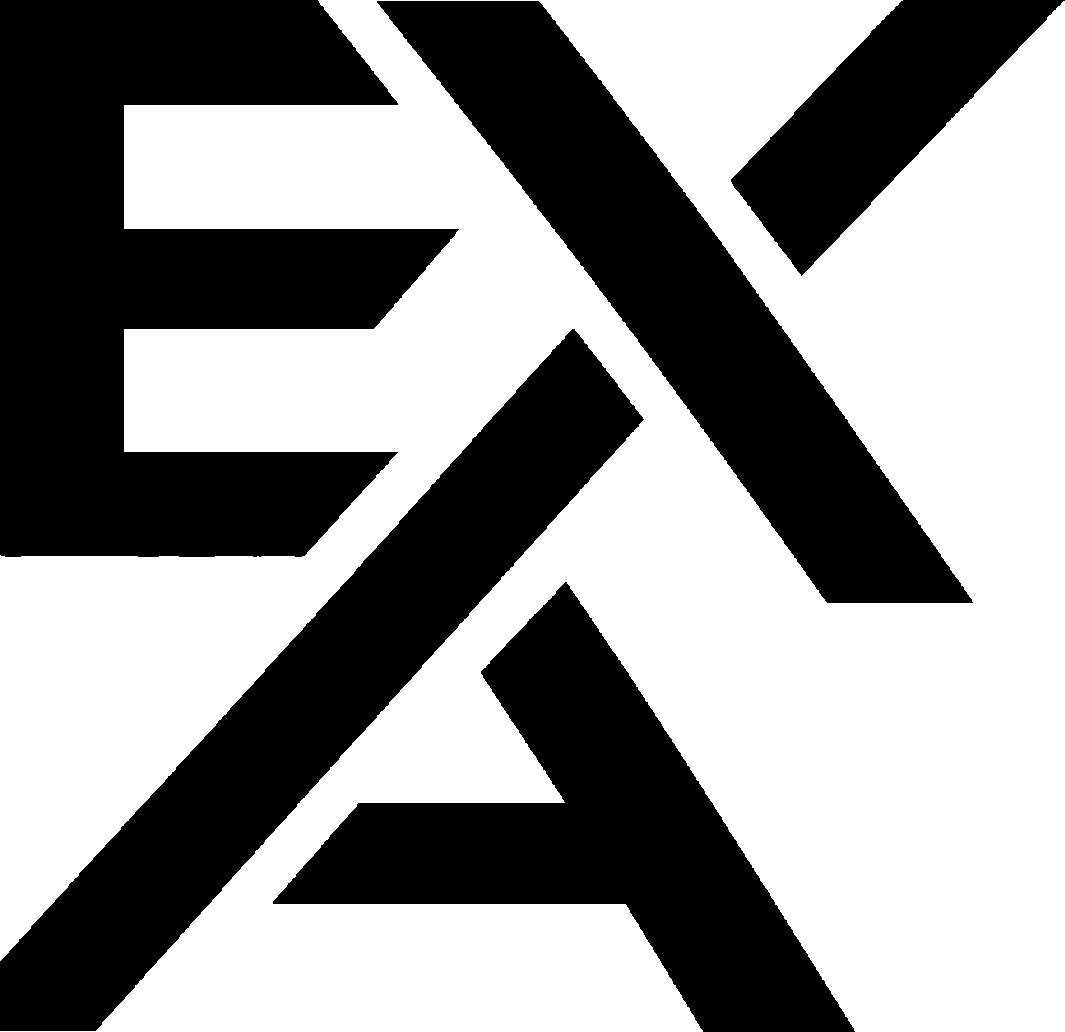
E and X on top, A tucked beneath, left edges of all three flush. It stands on its own without the words, and prints in one flat colour on merch, tablecloths and stickers.

Full logo
Lockup
The monogram completes both words: EXecution on the top line, Associates below. The top line is tracked about 9% so the final n and the final s end on the same vertical.
- Never add lettersThe words read "ecution" and "ssociates"; the monogram supplies E, X and A.
- Never set it in a serifSpace Grotesk Light only.
- Keep the edges flushE, X and A share one left edge; the line ends align on the right.
Typeface
Space Grotesk Light
Associates
The look
Sunset Neon
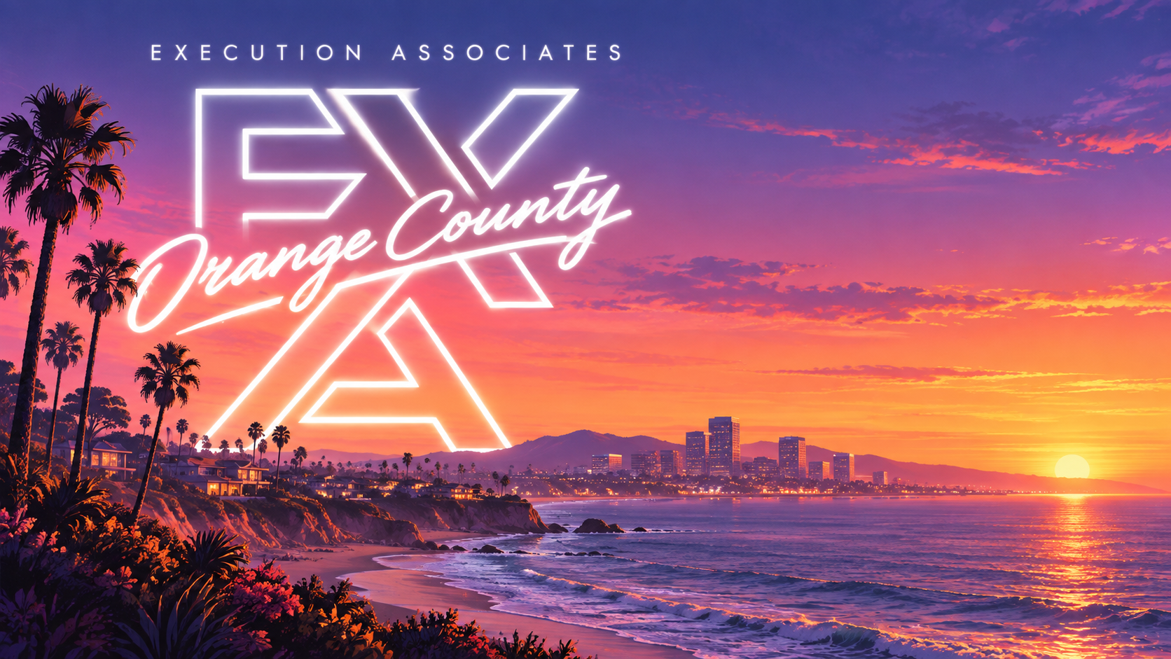
Orange County coastline at golden hour. The EXA monogram is a glowing white outline, "Orange County" is a bold neon-tube script with a swash crossing it, and a wide-tracked overline sits above. The key art is the reference for the look.


Colours sampled from the key art and banners.
Before the looks
Black & White
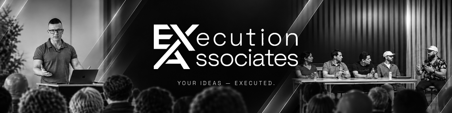
The original founders banner that Sunset Neon restyles: Stephan presenting on the left, Saul leading a panel on the right, the lockup centred over "Your ideas — executed."